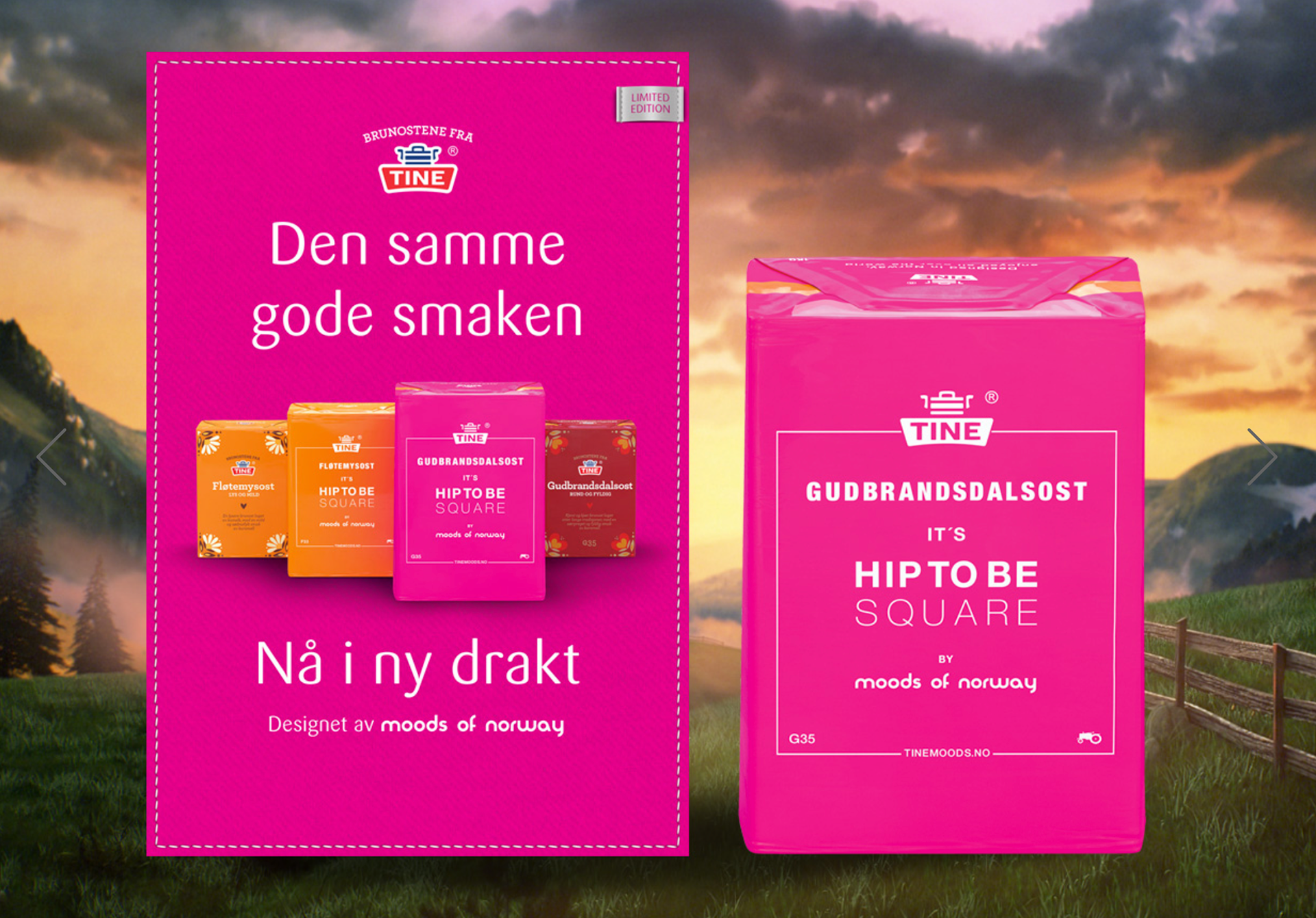
Brunosten is not as "top of mind" in younger audiences as before, and the big consumers of brunost have grown older. Brunosten was supposed to shine in front of the square at the back of the refrigerator.The solution is about design, values, communication and relevant context. And the good cooperation. This is where Moods of Norway is coming. A Norwegian icon, too. Driven by a philosophy deeply rooted in Norwegian traditions. An international brand based on traditions from Stryn and love to grandmother. Moods of Norway lives by revitalizing old traditions and icons by putting them into a new context, and now the brunette stood for luck!
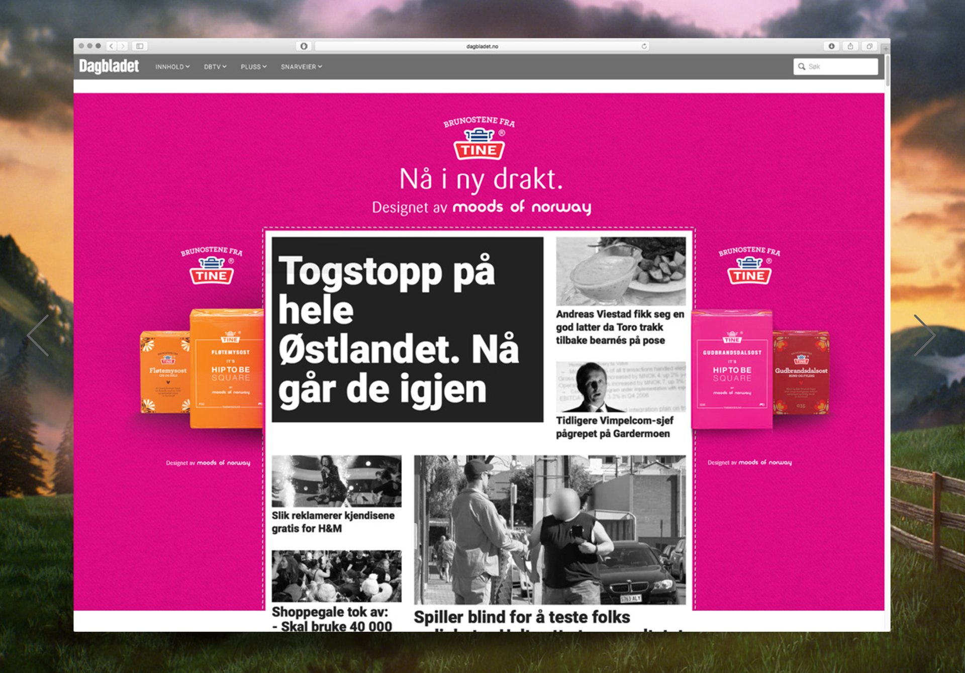
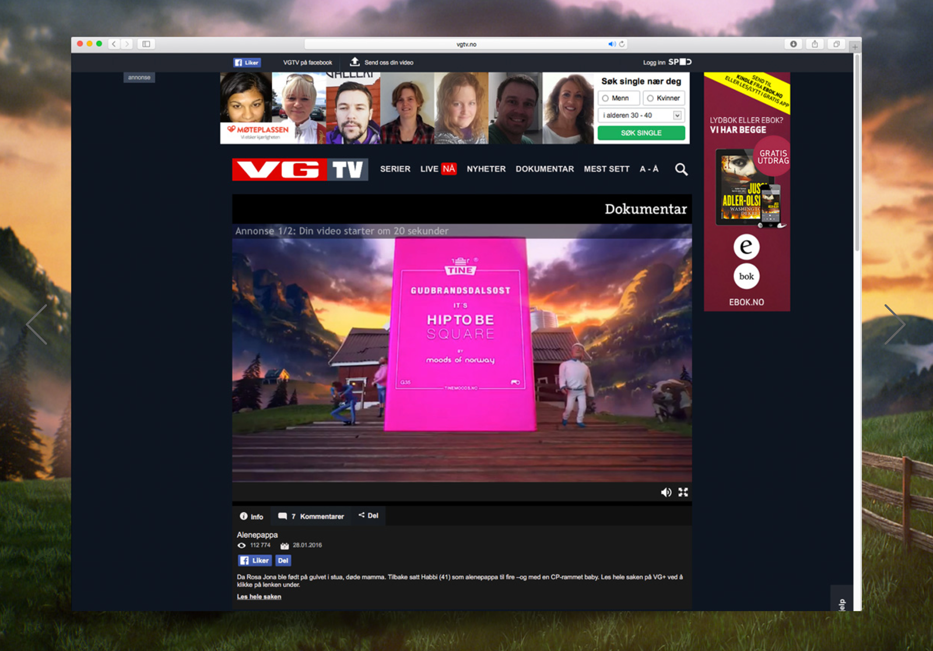
Brunosten has turned pink. The concept "It's hip to be square" and the pink wrapping is a tribute to Norwegian, to the traditions and to everyday life. The message is that it's perfectly ok to be a little ordinary and A4, let the brunette be the counterbalance of everyday pressure. And the new design can not help getting a more visible space, be it in a shelf or at home with the consumer. The goal is to get the target group to eat brown cheese, usually every day.Moods of Norway launches its new G35 dress collection, Brunostens own supporter collection, of course, while the brunette gets a new costume.
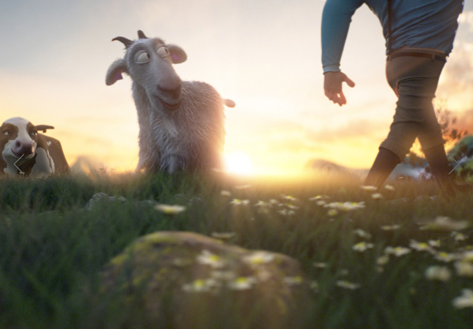
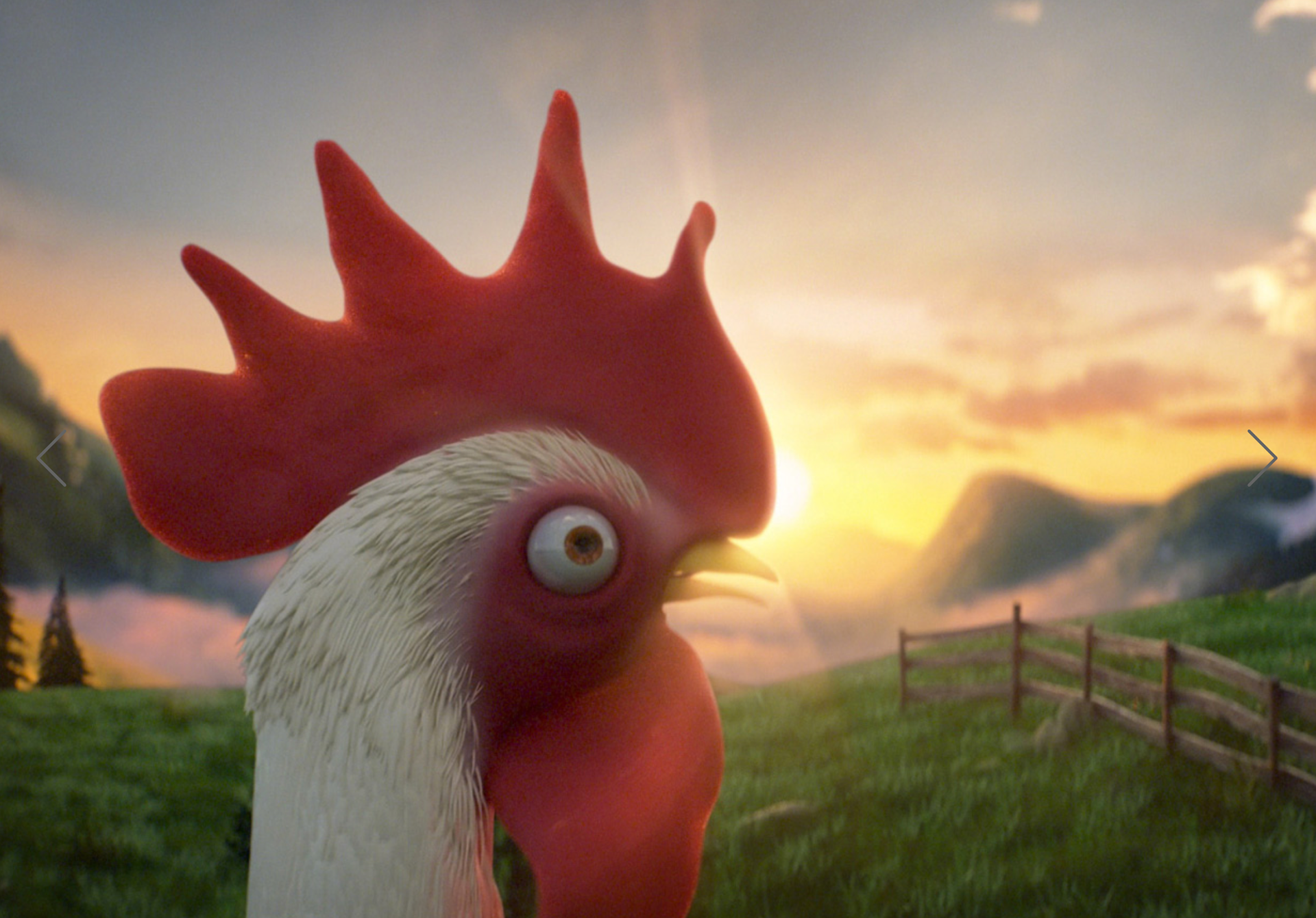
In addition to commercials, great retail campaigns were also being worked out.The film keeps it all together and tells the story in a playful way. There is also no "normal" animation solution that is produced."We have worked very carefully and structured to achieve the level we wanted for this production. The clothes are "sewn" in 3D and simulated with a very realistic method. Camera and light are set based on physical parameters. No cheating. All the inserts are rendered in 1 render with between 3 and 15 hours per image in render time. Each scene has around 7 lights that we have rendered as our own passport so we have had full control of adjusting lighting further after the render" says Axel Lavin, who has been responsible for the production of STIR.